Choosing a brand color palette for yourself comes down to four decisions: name the feeling your brand should give off, pick one primary color you can use everywhere, add two or three neutrals and one accent, then write down the rules for how much of each you use. Skip the trend-chasing and you can finish in an afternoon.
The part that stalls people is the belief that there is one correct shade. There isn’t. A palette is a small working system, and once you can name what each color does in it, choosing stops being a taste test and starts being a decision you can explain to a client, a developer or a printer.
Table of Contents
- What You Need
- Step-by-Step: How to Choose a Brand Color Palette for Yourself
- Define the Feeling Your Brand Should Communicate
- Collect Colors From Your Existing Visual World
- Choose One Primary Color
- Build Supporting Secondary and Accent Colors
- Test the Palette in Real-World Applications
- Create Usage Rules So the Colors Stay Consistent
- Common Mistakes
- Choosing Colors Because They Are Trending
- Using Too Many Competing Shades
- Copying a Competitor’s Palette
- Ignoring Contrast
- Testing on One Device Only
- Treating Favorite Colors as Brand-Appropriate
- Frequently Asked Questions
- How many colors should be in a personal brand color palette?
- Should my brand palette match my personal style?
- What is the easiest way to test whether colors work together?
- How do I choose brand colors that remain readable online?
- Can I use the same color palette for my wardrobe and my business?
- When should I revise a brand color palette?
What You Need
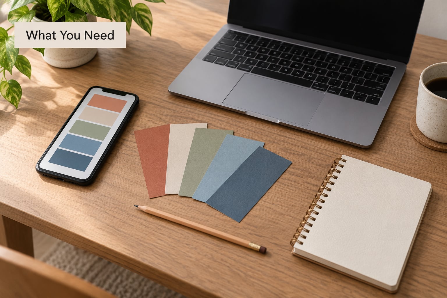
You need less than you think. None of this requires a design degree or paid software, and the whole process fits in one or two sittings.
- A phone or laptop for collecting references and running free palette tools in a browser tab.
- A way to capture color – printed swatches from a paint or craft shop, fabric offcuts, or an on-screen eyedropper that reads the hex code of any pixel.
- A notebook or mood board where every candidate palette lives, even the ones you reject.
- One written sentence about what your brand actually does and who it talks to. Colors chosen before this sentence exist have no filter.
- Something real to apply it to – a profile mockup, a slide, a banner, or your own outfit photos.
Step-by-Step: How to Choose a Brand Color Palette for Yourself
The goal is a flexible system, not a single perfect shade. You are building one primary color, one or two supporting colors, two or three neutrals and an accent, each with a job. That structure is what keeps a personal brand looking deliberate after the novelty fades.
Define the Feeling Your Brand Should Communicate
Start with three adjectives, not with colors. Write down three words you would use to describe the person or the room your brand belongs in – polished, bold, calm, playful, luxurious, approachable, editorial, technical. Three is enough; ten means you have not decided anything yet.
Then translate each adjective into visual properties rather than into a specific shade. Saturation does most of the work: muted and desaturated colors read calm and considered, while fully saturated ones read loud and energetic. Temperature comes next, with warm reds, oranges and yellows feeling closer and more urgent, and cool blues, greens and purples feeling calmer and more clinical. Value is the third lever, since dark palettes read serious and light palettes read open.
This shortlist is a starting point, not a verdict. Color meanings are personal, cultural and situational, and a shade that signals luxury in one market reads loud in another. Read the table below as a set of tendencies, not laws.
| Color | Often signals | Watch out for |
|---|---|---|
| Blue | Trust, competence, calm | Extremely common; a mid blue can vanish into a crowded feed |
| Red | Passion, urgency, appetite | Reads as aggression or sale signage in large blocks |
| Yellow | Optimism, warmth, friendliness | Screams at full saturation; poor contrast for text |
| Green | Growth, health, naturalness | Split between fresh produce and money in some contexts |
| Purple | Creativity, intuition, premium feel | Muddy quickly; needs a warm or cool lean to stay sharp |
| Pink | Playfulness, softness, modernity | Can read juvenile if paired with rounded shapes and bubbly type |
| Orange | Energy, creativity, accessibility | Holds up on clothing better than on small screen text |
| Black | Authority, minimalism, luxury | Used for everything, it flattens the rest of the palette |
| White | Cleanliness, space, modernity | Needs a neutral beneath it or it can look like an unfinished page |
| Beige, taupe, stone | Warmth, quiet luxury, timelessness | Very similar shades photographed badly turn to mud |
The fastest way to test your adjectives is the celebrity or room test. Ask which brand you would rather be mistaken for, then check whether your candidate colors could plausibly sit on the same shelf as it. It is not science, and it rules out more than it confirms.
Collect Colors From Your Existing Visual World
Your references already exist. Look at the clothes you reach for most, the rooms you have redecorated twice, the photos you saved, the accounts you follow without thinking about why. Then count which hues keep showing up. Repeated presence is a signal; a single striking image is just taste on a good day.
Photographs are the most reliable source because they already contain a working set of related colors. Use a free on-screen eyedropper to read the hex code of three or four tones from one photo you love, and drop them into a palette tool. That gives you colors that already agree with each other, and you refine from a known-good starting point instead of assembling shades by hand.
Seasonal color analysis is a useful shortcut if you are stuck. The Spring, Summer, Autumn and Winter system groups people by the temperature and depth of the colors that flatter them, and the result narrows your shortlist fast. Treat it as a filter, not a verdict, and check any result against real swatches in daylight.
One last separation matters. Split your references into colors that are yours and colors that are currently trending. Trending shades get picked because they are everywhere this quarter, and they age in a way your own preferences will not. If a color would still make sense to you after it disappeared from every feed, keep it.
Choose One Primary Color
Your primary color is the one people see most, so it has to survive being used badly. Narrow a shortlist of five to six candidates by running each through four checks.
- Small-size legibility. View it at the size of a profile picture or an app icon. If it turns into a dark smudge, it needs a tint or shade to work.
- Print survival. Hold the swatch under daylight. Screen colors built from RGB are bright and a little cold, so anything electric on screen usually prints duller and warmer.
- Feed distinctiveness. Put it next to the four colors used most in your category. Common shades make you forgettable even when they work well.
- A text partner. Every primary needs a dark or light neutral that can carry body copy against it, and you should lock that pairing on day one.
When two candidates tie, pick the one that behaves better in clothing and packaging, because those are the places a personal brand gets judged first. A shade that looks elegant on a woven label rarely embarrasses you in a caption or a slide.
Build Supporting Secondary and Accent Colors
A workable palette runs one to two core colors, two or three neutrals, one functional accent and one emotional accent. The functional accent does a job, such as link text, a button or a highlight. The emotional accent adds character and can be dropped for corporate settings without breaking anything.
Use color relationships rather than random pairings. Analogous colors sit next to each other on the wheel and give a calm, unified look. Complementary colors sit opposite and create the strongest contrast, which makes them ideal for an accent but tiring at full volume. Split-complementary uses one base color plus the two neighbors of its opposite, so you keep contrast without the shock.
Two or three neutrals do the heavy lifting. A warm off-white, a mid stone and a near-black give you backgrounds, body text and rules without adding a new color to manage. If your palette has five or more saturated colors, the neutrals are what stop it from looking like a paint chart.
Test the Palette in Real-World Applications
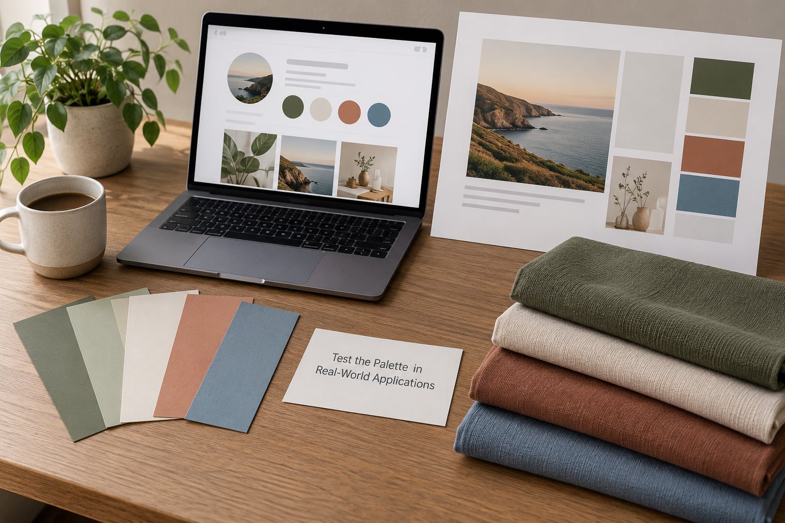
A palette that only exists on a mood board is a wish. Testing takes about fifteen minutes if you apply it to real layouts instead of abstract squares.
Put the colors on the things you actually use. A social profile grid, a LinkedIn banner, an email signature, one presentation slide, a resume accent line, packaging mockup, or three outfit photos shot in the same light. Watch how each color behaves against photography, because most brand surfaces are somebody else’s colors competing with yours.
Then check contrast properly. WCAG 2.1 Level AA asks for a 4.5:1 ratio between body text and its background, and 3:1 for large text. A free contrast checker online will tell you in seconds, and the same standard applies to your captions, your email links and anything a client will read on a screen in bad light.
Run the five-second test on someone who has never seen your brand. Show it for five seconds, take it away, and ask what feeling they remember. If they describe your three adjectives, the palette is working. If they say “nice,” it is too polite to be memorable.
Two practical caveats. First, colors that look great on screen can print badly, and designers on r/graphic_design consistently advise against converting an RGB value straight to CMYK because the conversion is inaccurate. If print matters to you, work from a physical swatch book. Second, if you ask an AI tool for your palette, use it to generate options rather than to decide. It has no idea what your audience already associates with your work.
Create Usage Rules So the Colors Stay Consistent
Consistency comes from ratios, not willpower. Two rules cover almost every case, and they mean the same thing at different scales.
| Rule | Breakdown | Where it fits |
|---|---|---|
| 60-30-10 | 60% dominant, 30% secondary, 10% accent | Interiors, big layouts, presentation slides |
| 3-7-27 | 3 colors for roughly 27% of the palette, 7 for 70% of the remainder | Wardrobes and small physical sets |
In practice, most of your surface should be a neutral. Your primary shows up on headers, logos and calls to action, the secondary carries secondary panels and dividers, and the accent appears once or twice per page. If the accent is everywhere, it stops being an accent.
Write the rules down where you will see them. A one-page document with your hex codes, the approved pairings, the background options and a line that says when the palette must not be expanded stops most drift. If you already have an identity, treat this as a rulebook rather than a rebuild, and document what exists before you change anything.
Finally, note how you will hand colors off. Keep hex codes for anything on a screen, RGB values for digital work, CMYK or a spot color matched from a physical swatch for print. A short reference list with those values attached stops the color from shifting between your laptop, your phone and a printed piece.
Common Mistakes
The wrong palette almost always traces back to one of a handful of habits. Each has a straightforward fix.
Choosing Colors Because They Are Trending
A shade picked because it is everywhere this quarter will look dated once it is not. Fix: keep the trending color as an accent at most, and build the palette around a tone you already chose on your own terms.
Using Too Many Competing Shades
Six saturated colors with no roles is the most common reply when designers ask how many is too many. Fix: cut to one primary, one or two supports, three neutrals and two accents, and assign each one a percentage.
Copying a Competitor’s Palette
Borrowing a rival’s colors makes you look derivative in the one place your audience already knows what to expect. Fix: use competitors to see the category, then pick the hue they are all avoiding.
Ignoring Contrast
Unreadable body text is the defect clients notice first, and it usually shows up late. Fix: run every text and background pairing through a contrast checker before you commit, and again after any change.
Testing on One Device Only
A palette tuned on a bright laptop can fall apart on a dim phone or an e-ink tablet. Fix: view your main layouts on the three devices you actually use before you sign off.
Treating Favorite Colors as Brand-Appropriate
Liking a color says nothing about whether it supports the idea you are selling. The r/Entrepreneur thread on this question puts it plainly: the color should support the customer-facing idea, not just your taste. Fix: check every favorite against your three adjectives and drop the ones that contradict them.
Finally, apply the aging test. Imagine your palette on your materials three years from now. If one color makes you flinch and the rest feel like you, drop that one now rather than paying for a rebrand later.
Frequently Asked Questions
How many colors should be in a personal brand color palette?
Most personal brands work well with one primary color, one or two supporting colors, two or three neutrals and one accent. That is five to seven entries, but only three or four are actually saturated. The neutrals do the background and text work, and the accent appears once or twice per layout. If you find yourself arguing about a fifth saturated color, it is probably a neutral in disguise.
Should my brand palette match my personal style?
It should be adjacent rather than identical. If your wardrobe is warm neutrals and deep greens, a palette built on the same temperature and depth will feel like you without looking like a uniform. The test is whether a stranger who meets you in person would recognize the palette as yours. Start from your existing colors and shift one hue to keep it from reading as a copy.
What is the easiest way to test whether colors work together?
Apply the palette to real layouts rather than swatches: a profile grid, a slide, an email signature and a banner, all shot or viewed at the same time. Then check body text against its background with a free WCAG contrast checker, aiming for 4.5:1 on small text. Finally, run the five-second test on someone unfamiliar with your brand and ask what feeling they remember.
How do I choose brand colors that remain readable online?
Pair every text color with a background and check the contrast ratio before you commit. WCAG 2.1 Level AA requires 4.5:1 for body text and 3:1 for large text, and most free online checkers return the number instantly. Keep one near-black or off-white neutral reserved for body copy and one saturated color reserved for links, buttons and highlights, so decoration never competes with reading.
Can I use the same color palette for my wardrobe and my business?
Yes, and most personal brands do, but the roles differ. In clothing your neutrals carry roughly seventy percent of what you wear, with two or three colors doing the rest. In a brand system the primary and neutral do most of the work on screen and the accent does the highlighting. Use one set of colors with different percentages, and you get consistency without making every outfit look like a logo.
When should I revise a brand color palette?
Revise when the palette stops matching the work, not because a new season brought a new shade. Practical triggers include a change in positioning, a rebrand you have to do anyway, colors that print badly in your usual materials, or a primary that has become indistinguishable from every competitor in your category. If nothing about your business has changed, a palette that still passes the three-year test should stay as it is.
Start tonight with the three adjectives and the audit of your own saved images. Turn what repeats into a shortlist of five, narrow it to one primary, and write down how much of each color you will use. Learning how to choose a brand color palette for yourself takes one honest sentence about who you are for, followed by fifteen minutes of testing on layouts you actually use.