To mix prints without clashing, share a colour between them, keep the two patterns at clearly different scales, and ground the whole outfit with a neutral solid. Stripes with florals, gingham with paisley, leopard with denim — every combination looks deliberate once those three rules are in place.
The reason this feels risky is social, not technical. Nobody is going to stop you at the supermarket, but plenty of women were taught in their teens that two patterns in one outfit is one too many, and they have carried that rule around ever since. Meanwhile their wardrobes get fuller and the prints pile up unworn.
Here is the honest version: mixing prints is a repeatable technique, not a mood. It is closer to colour theory than to guesswork. Pick one piece to lead, repeat a single colour across the other, and make sure one print is big and one is small. Below is the full method, in order.
You need surprisingly little to practise on.
Table of Contents
- What You Need
- Step-by-Step: How to Mix Prints Without Clashing
- 1. Choose a Dominant Print
- 2. Build the Color Story
- 3. Vary the Scale When You Mix Prints Without Clashing
- 4. Separate or Repeat the Pattern
- 5. Balance Proportion and Placement
- 6. Finish With Simple Accessories
- Common Print-Mixing Mistakes
- Combining Three Loud Prints at Once
- Using Too Many Colours With No Anchor
- Pairing Prints at the Same Scale
- Ignoring Garment Proportion
- Matching Shoes and Bags to Every Print
- 5 Outfit Formulas You Can Copy
- Frequently Asked Questions
- What are the rules for mixing patterns?
- How to wear clashing prints without looking tacky
- Do polka dots and stripes clash?
- Can you mix more than two prints in one outfit?
- What if my prints do not share any colors?
- How do I mix prints for work or a job interview?
- Conclusion
What You Need
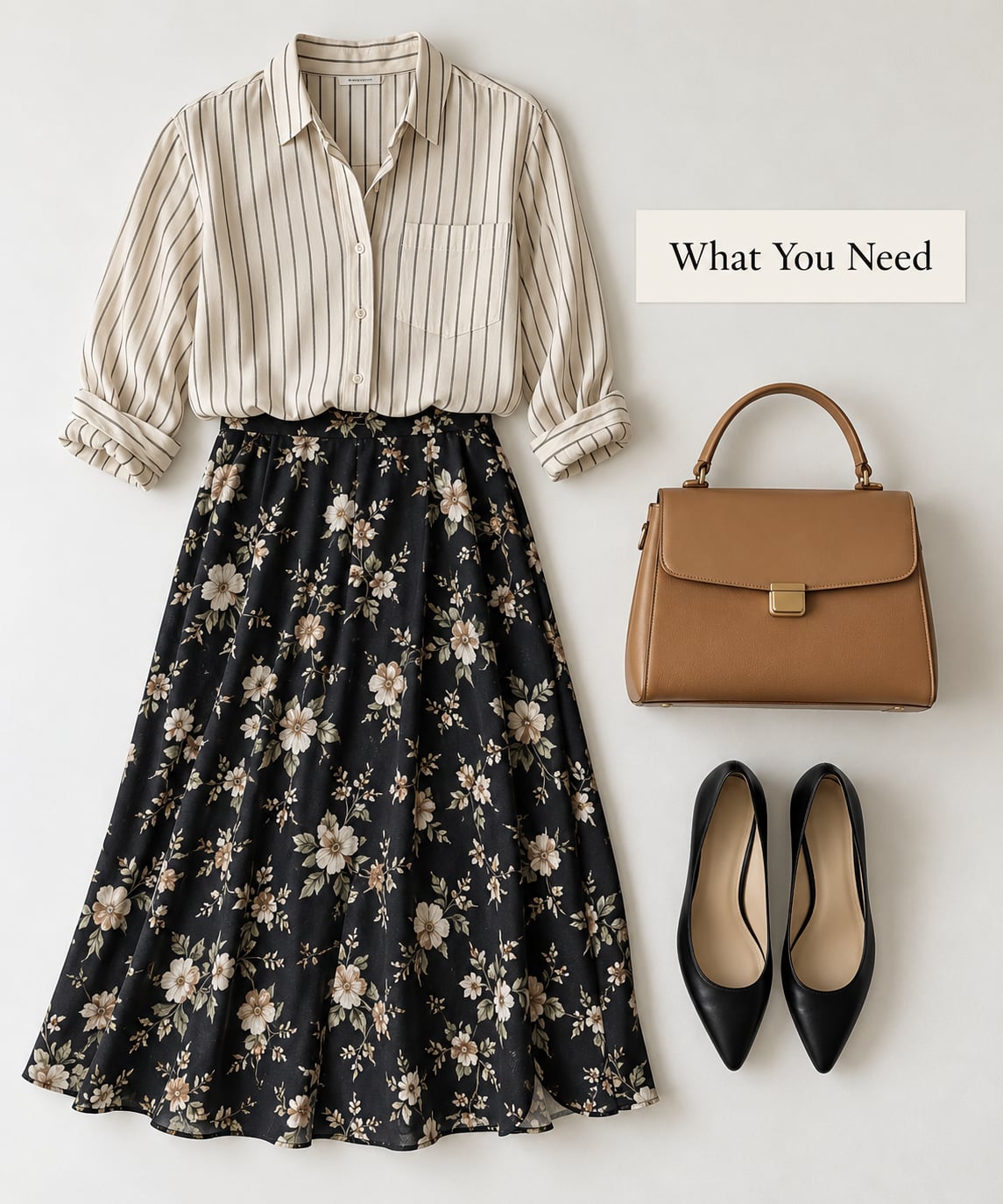
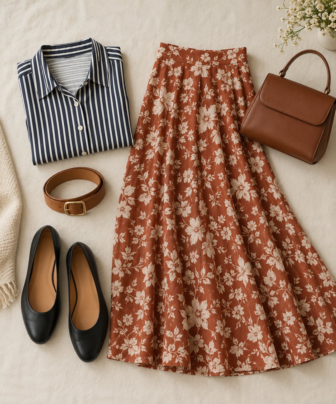
Two printed pieces is the minimum: one larger statement print and one smaller supporting print. Beyond that, you need a solid base — a plain top, a neutral skirt, a belt, or a blazer — plus shoes and a bag in a single colour with no pattern on them.
These do not have to be new purchases. A striped shirt you already own and a floral skirt you have worn twice counts. The point is to have one thing to lead the look and one thing to hold it together, so you can test the method before you go shopping.
The same six pieces cover dresses, skirts, tops, trousers and scarves, because the rules stay the same no matter which garment carries the print. What changes is which print sits closest to your face and which one takes the visual weight.
Step-by-Step: How to Mix Prints Without Clashing
1. Choose a Dominant Print
Decide which print is the main event and keep the other one clearly quieter. A large floral skirt with a narrow-striped blouse works because the skirt wins and the stripes read almost as texture.
What does not work is giving two prints of similar loudness equal space — a big floral blouse over an equally big floral skirt. The eye has nowhere to land, so the whole outfit reads as noise rather than design.
A quick test: if you squint and can only describe one print, your hierarchy is right. If you describe two at once, one of them needs to go or shrink.
2. Build the Color Story
Connect two prints by repeating one colour. A rust stripe and a rust-and-cream floral already belong together, even though the patterns themselves have nothing in common.
You have three workable options. Repeat a single colour across both prints, restrict everything to one colour family of two or three shades, or pick one print from a colour story and let the other stay a neutral toned print.
When your two prints genuinely share nothing, the colour story becomes something you add rather than something you find. A rust belt, a tan bag, or mustard earrings pull two unrelated prints into the same family.
Borrowing a colour from the colour wheel works the same way without any shared colour at all. Deep blue and rust sit opposite each other, a soft olive and dusty pink sit next to each other, and burgundy with mustard is the festive version. Opposites need a third solid to sit between them, usually black, cream, tan or denim.
3. Vary the Scale When You Mix Prints Without Clashing
This is the rule people get wrong most often. Two prints at the same size fight, because they compete for attention at the same frequency. One large print beside one small print settles into a clear order, and the smaller one recedes into texture.
Practical combinations that hold up: a wide stripe with a small floral, chevron with a micro-dot, an oversized graphic with a fine check, or a large-scale botanical with a thin pinstripe.
If both prints look busy from across a room, that is a scale problem, not a colour problem. Changing one of them usually fixes it faster than swapping either colour.
Scale has a rough working order, from smallest to largest: micro-print such as a fine dot or pinstripe under about a tenth of an inch, small motifs like a daisy print, medium motifs like a classic block print, and oversized motifs on a maxi dress or a wide statement scarf. Keep at least one step between the two prints you pair.
Structured prints and organic prints also differ in scale behaviour. Stripes, checks, chevrons and houndstooth all read as geometry and want a large companion. Florals, paisley and animal prints are already busy, so they suit a much smaller second pattern.
Once the scale rule is in place, the pairings narrow fast. Here is the short version, and it is worth pinning up while you experiment.
| Combination | Verdict | Why |
|---|---|---|
| Wide stripe with small floral | Works | One is structure, one is organic, and the scales are far apart |
| Gingham with large paisley | Works | Gingham is a light grid that reads as a neutral once it is small |
| Leopard with fine pinstripe | Works | The pinstripe sits below the leopard’s noise level and shares its warmth |
| Plaid with micro-dot | Works | The dot adds rhythm without competing for attention |
| Tweed with small botanical | Works | Textured weave plus a quiet print, with leather as the neutral |
| Chevron with small floral | Works | Strong geometry needs the softer, larger print to balance it |
| Houndstooth with large stripe | Works | Both are structured, so pairing two of them stays controlled |
| Floral dress with plain blazer | Works | One print plus a solid is the easiest entry point there is |
| Denim with anything | Works | Denim reads as a neutral once the wash is even |
| Small floral with medium floral | Risky | Same pattern family at two close scales muddies into one texture |
| Bold stripe with bold stripe | Risky | Different colours and equal weight compete for the same line |
| Two animal prints | Risky | High contrast plus high visual weight, with no quiet space between them |
| Polka dots with polka dots | Risky | Fine if the dot size is wildly different, otherwise it looks accidental |
| Two large florals | Avoid | No hierarchy, no rest point, no dominant print |
| Plaid with plaid | Avoid | Same scale, same structure, two competing grids |
| Large graphic with large graphic | Avoid | Nothing quiet anywhere in the outfit |
Two notes on reading that grid. Anything in the avoid column can be rescued with a solid layer over the top and a much smaller print underneath, and anything in the works column can still fail if the colour palette is muddled. Pairing logic gets you most of the way there, not all of it.
4. Separate or Repeat the Pattern
Two different prints are far easier to wear when something calm sits between them. A plain blazer over a printed dress, a solid belt at the waist, or flat leather shoes all create a visual pause.
Repeating a print works too, and it is more deliberate than most people expect: the same stripe at two different scales, or the same floral in two different colourways. That is a pattern-mixing technique with real precedent on runways, and it is far easier to wear than two unrelated prints.
5. Balance Proportion and Placement
Put the boldest print near your face or on the main garment. Prints that sit high and close to the face get read as an intentional choice; prints scattered across the middle of the body compete with your silhouette instead of supporting it.
Leave skin showing. An open neckline, rolled cuffs, or a hem that stops mid-calf creates breathing room, and breathing room is what keeps two prints from closing in.
Fit matters as much as pattern here, which is a point that comes up constantly in styling forums and rarely appears in print guides. A badly fitted striped shirt next to a beautiful floral skirt looks like a mistake, and people will read it that way no matter how well the colours work.
Print scale also changes with your proportions. On a petite frame, small-scale prints add length because the eye reads the fine detail as continuous surface rather than as separate shapes, and a wide vertical stripe stretches further than a wide horizontal one. On a curvy frame, a large print reads smaller than it actually is once it follows a curve, so plenty of women with fuller shapes get more out of large-scale botanicals than they expect.
6. Finish With Simple Accessories
Solid shoes, a plain bag, and simple jewellery let the prints do the talking. One deliberate extra print, such as a striped scarf or printed belt, is fine as long as it repeats a scale or a colour already present.
Skip printed shoes next to a busy outfit. They sit at eye level, pull focus downward, and are the single accessory that most often undoes an otherwise balanced look.
If you are starting from zero, treat certain prints as neutrals and mix those first. Narrow navy-and-white stripes, an even-wash denim, a fine cream pinstripe and a low-contrast leopard all behave like solid colours once they are small and repeated, which gives you a safe pool to build from before you touch a bright floral or a graphic print.
Before you leave the house, do a quick scan in the mirror at arm’s length. You want one obvious focal point, at least one area of unprinted skin or solid fabric, one shared colour visible in more than one piece, and no more than one busy thing on each half of your body. If all four hold, the look is intentional and you can stop checking it.
Common Print-Mixing Mistakes
Combining Three Loud Prints at Once
Three bold patterns can work, but only with a strict hierarchy: one dominant, one mid-scale, one micro-print, plus a neutral. If you cannot rank all three prints from loudest to quietest, you are looking at three statements fighting.
Using Too Many Colours With No Anchor
Eight colours in one outfit reads as a mistake unless a single colour repeats across every print and accessory. Pick one anchor colour and hold it everywhere.
Pairing Prints at the Same Scale
Two large florals, or two medium checks, need one of them to be much smaller than the other. If you own both at the same scale, insert a solid piece between them instead.
Ignoring Garment Proportion
A busy print on both top and bottom halves the body in two and reads as a block. Put the print on one half and keep the other half solid, or make sure a long open layer separates them.
Matching Shoes and Bags to Every Print
Accessories should settle the outfit, not add another pattern to track. One colour, one material, done.
A few habits that make the whole thing faster: keep one small-scale print in your wardrobe permanently for pairing with anything, and treat a scarf as a trial run before you commit a garment to a printed outfit. Shop for prints with one colour you already own at home, not just one that looks good on the hanger.
5 Outfit Formulas You Can Copy
Rules are easier to use when they arrive as a fixed recipe. Each of these follows the same order: one dominant print, one supporting print at a different scale, one neutral, one colour repeated.
Large floral midi skirt, narrow-striped tucked blouse, plain tan belt, flat leather sandals. Add one of those prints to a scarf later and the whole thing still holds.
Small gingham shirt worn open over a plain cream tee, with a leopard skirt in a matching warm neutral and black shoes. Two prints, one shared colour, one hard break in the middle.
Fine pinstripe trousers with an oversized graphic tee half-tucked at the front, a solid black jacket on top, and white sneakers. The jacket does the neutral work here.
Structured houndstooth blazer over a plain top, paired with a large-scale floral skirt in one of the blazer’s colours. Same colour family, opposite scales, blazer as the anchor.
Tight micro-print top with a solid midi skirt and a second, much larger print used only on a bag. If you want to test the method cheaply, the extra print belongs on the accessory rather than the garment.
Fabric counts too. A cotton poplin printed blouse under a silk or viscose printed skirt moves beautifully because the two surfaces catch light differently. Two prints in the same heavy fabric start to merge into one busy surface.
The same logic carries into a room. A large rug with a small-scale cushion, a plain sofa and one patterned throw follows the identical rules of scale, shared colour and rest space.
Frequently Asked Questions
What are the rules for mixing patterns?
Three rules cover almost every combination: repeat a colour between the two prints, keep the two patterns at clearly different scales, and ground the outfit with a neutral solid piece. Keep one print dominant so the eye has somewhere to land. Change colour first when a pairing fails, then scale, because colour is usually the cheaper fix.
How to wear clashing prints without looking tacky
Clashing prints look accidental when they share colour, share scale, and share visual weight all at once. Fix just one of those and the same outfit reads as intentional. Add a neutral between the two prints, vary the scale, and repeat one colour. Confidence matters less than most people assume; the technique does the work.
Do polka dots and stripes clash?
They work well, because both are structured patterns with an obvious scale. Keep the dot noticeably smaller than the stripe, repeat one colour between them, and add a solid piece such as a plain belt or flat shoes. Two same-size versions of either pattern in one outfit is what turns this pairing risky.
Can you mix more than two prints in one outfit?
Yes, as long as you can rank them. One dominant print, one mid-scale, and one micro-print, tied together with a repeated colour and a neutral, works every time. Three prints without that hierarchy reads as a quilt. If you are unsure, two prints plus one patterned accessory is the safer version.
What if my prints do not share any colors?
Then change the colour story rather than the prints. Add a solid in a shade that sits between the two families and repeat it in an accessory, a belt, or a shoe. Alternatively repeat one print in a second colourway, which gives you the rhythm of mixing without depending on a colour match at all.
How do I mix prints for work or a job interview?
Keep the louder print small in scale and away from the face, and let the larger garment be the neutral. A small-scale print under a plain blazer reads polished; two bold prints with no separator does not. For interviews, stay at one print plus one solid and save the full combination for everyday work outfits.
Conclusion
Start with one print as the focus, repeat a single colour across the second, and make sure the two are at different scales. Add a neutral between them if you want a softer version of the look.
That is the whole method, and it still works in 2026 whatever the season. Do those three things tonight with two pieces you already own, and you will have more outfits to work with than the single-print rule ever allowed.
Once it feels normal, the next step is easier: repeat one print in a second colourway, or add a third print at a micro scale. Both move you further from the safe middle than most people ever expect to go.